
Go to their website and at the top there’s a search bar for you to type in the city or region you want to look up. Below is an excerpt for the Everglades that I pulled up as an example. I’ll dissect each area and explain what each means, and show you what a powerful tool for photography this can be!
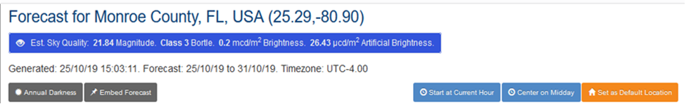
Here we have the upper most portion of the site. You’ll see the area you chose to search with the
coordinates. (To be specific, these coordinates are located about 5 miles southwest of Mahogany Hammock boardwalk, 20 mi from the park entrance, and 27 mi from Robert is Here fruit stand—as the crow flies. Just to give you an idea how far away from the city this is.)
Underneath the location is the Est. Sky Quality in the blue bar. This gives you a generic sky clarity statement for the area. (Remember, this website is “clear outside” so it was meant to predict clear skies for astronomy viewers. Well, we as photographers can use it for that, and use the opposite for our landscapes.)
1) 21.84 Magnitude. This is a measurement of the mmps of the skyglow. (MMPS stands for ‘magnitude per square arcsecond’ and is irrelevant.) Below are the conditions which represent different magnitude readings.
22.0 is the average brightness of a moonless night with no artificial lights.
21.0 is similar to a rural area in the eastern U.S., near a medium-sized city.
20.0 is similar to the outer suburbs of a major metropolis.
19.0 is similar to a suburb with widely spaced single-family homes.
18.0 is similar to a bright suburb or dark urban neighborhood.
17.0 is similar to the center of a major city such as Miami.
So you can see just how dark it is far away. For comparison, near the entrance of the park is 21.00, near the Seminole Theatre in downtown Homestead is 18.38, and downtown Miami is 17.68. Basically, the higher the number, the darker it is.
2) Class 3 Bortle. This is another measurement of darkness of the night sky, of which there are 9 classifications:
Class 1: Excellent dark-sky site
Class 2: Typical truly dark site
Class 3: Rural sky
Class 4: Rural/suburban transition
Class 5: Suburban sky
Class 6: Bright suburban sky
Class 7: Suburban/urban transition
Class 8: City sky
Class 9: Inner-city sky
Here, the lower the number, the darker the sky.
3) The other values listed in the blue box are of very little consequence. These above will give you plenty of information necessary.
4) The line below the blue bar is the date you generated the list, (this is a European chart with European dates and times). This was generated on Oct. 25, 2019 at 3:03pm, and it shows a week’s worth of dates (other dates not displayed for this demonstration).
5) The gray button under the date, on the left, will give you a diagram of the amount of light vs. dark skies throughout the year in that specific location. The next gray button will give you a link so you can use it on your website. The three buttons on the right are pretty self-explanatory.

This next section here is the real meat of the site.
1) On the far left you have your day of the week and the date. Like I said on the previous page, there are 7 days on display at any given time. The current date is always “open” or “expanded”, the others basically show the above features until they are expanded. If you want to expand another date, you go to that date, and click on it to expand it.
2) Next you have a diagram of the moon, the moon phase, and the percentage of brightness of the moon. Under that you have the upward facing triangle with the moon rise time, and the downward facing triangle with the moon set time. What you don’t see is if you hover over this area (on a computer) it will give you additional moon meridian details.
3) On the top bar, to the right of the moon details, are the hours of the day. In the display shown here, it starts at noon, goes till 11am the next day (this is customizable). It shows 24 hours on a normal display. The hour block with the clock in it is the actual time. You can slide these hours to show before or after the current hour. Now, the fun part... the colors! This lets you easily see at a glance what the sky is predicted to be, using a stoplight-style color scheme. Where green is clear skies (not shown here), orange is a sky with potential, and red is pretty much clouded over. Like I said, this is website is “clear outside”, what may be green (good) for astro, would be bad for landscapes. So we can use this to our advantage to locate which ever sky we’re looking for. Orange or red would mean clouds and potentially a great sunrise or sunset, or just clouds, maybe thunderstorms? Clouds are clouds, what they are doing can’t be predicted by this website.
4) These next two bars are the coolest feature.
Top row displays the sun (or day) and bottom row displays the moon (or night). The different colors in the top: yellow is daylight, and orange is the golden hour. The different gradients of blue represent Astro Dark, Nautical Dark, Civil Dark, and the black is night. The red bar shows the sun’s meridian.
The bottom moonlight bar shows the moon’s visibility. Grey indicates it is visible, dark or navy blue is not visible. The red vertical bar indicates the meridian.
If you hover your mouse over this area, you will see the exact times for each displayed.

This section here is also a section you will use on a regular basis. These are your cloud percentages. Remember, you’ll have the hours shown above these so you’ll know what time each of these percentages correlates to. Also of note, the colors of the blocks also gives an indication of the presence of clouds. The blue blocks indicate something more transparent, while the lighter blocks are more dense clouds. Totally white blocks mean pretty much a clouded over day.
1) First row shows the total amount of clouds in the sky and the percentage of sky that’s obscured.
2) Second row shows the low clouds, the clouds low to the ground, the ones that could possibly block a sun rising or setting against the horizon and the percentage obscured.
3) The third row are the medium level clouds and the percentage obscured.
4) And finally the last row we have the high clouds and their percentage obscured. These are the clouds that generally light up before sunrise or after sunset as the sun is striking them at just the right angles to reflect those colors.
So what do these mean. Well, if you go to the beach and are looking for that big orange ball to rise for sunrise, you’ll want a very small number during the sunrise hour for the low clouds. If you want a colorful sunrise or sunset, you’ll want some high clouds. If you’re looking for storms, perhaps a lot of mid level clouds is what you’ll be looking for. It all depends.
Of course, these are only predictions. But from the people I’ve followed on YouTube, this is what they use to predict what they are looking for. Comes highly recommended from the Brit Photogs.

Here are the rest of the rows. Most are pretty self explanatory, but some I’d like to mention and explain.
ISS Passover—This is for the International Space Station. If you hover your mouse over the block with the logo, it will give you the start, max, end and magnitude times it will be overhead, with directions.
Precipitation Type—Here they’ll list what type of precipitation you’ll get (if any). Very light rain, light rain, rain, snow, etc. Just hover your mouse over the specific block.
Wind Speed/Direction—Here they’ll list the wind speeds as well as directions and if you hover over the block, it’ll list it (for example, the one on the left shows ‘20 mph from the east (96°)’)
Chance of Frost—Not much chance here in SoFla, but once in a while, we might get that one day in the winter where it’s possible. It will show a snowflake in the image. You can also hover over the block.
For some of the rest, you may have to convert °Celsius to °Fahrenheit. Take the °C temp, multiply x 1.8 and add 32. Or to make it simple and get a ballpark figure, take °C temperature, multiply by 2, and add 30.
Accurate — 30°C x 1.8 = 54 + 32 = 86°F
Ballpark — 30°C x 2 = 60 + 30 = 90°F
Four degrees off — but sure beats taking out a calculator.
Accurate — 20°C x 1.8 = 36 + 32 = 68°F
Ballpark — 20°C x 2 = 40 + 30 = 70°F
Only two degrees off — like I said…
Accurate — 10°C x 1.8 = 18 + 32 = 50°F
Ballpark — 10°C x 2 = 20 + 30 = 50°F
Hmmm, not a bad conversion. So just take °C multiply by 2 and add 30. We’re not recording data for NASA.
One last thing to remember, the color scheme. Green is good if you want comfort and clear skies. Take that into consideration when looking at the colors. Check out the website for more info! Enjoy the sky!